关于css的border属性相信大家已经熟悉的不能再熟悉了。那么是不是这就意味border没有什么可以探究了呢? now,let learn something that we never konew about!
我们知道CSS3可以很简单地创建圆角,而CSS2要实现圆角效果就复杂多了。在这些新技术未出现之前,我们可以通过使用绝对定位背景图片来显示圆或箭头,这就意味着需要另外的图片处理工具(如photoshop)配合使用。其实,如今显示圆或者圆角已不再需要其他背景图片了。
1.The Basic
可以经常看到border的一下用法:
1
| border: 1px solid black;
|
上面代码的意思为给元素加上一个1px的边框。这是border属性的简写方式,普通而又简单,我们也可以拆分如下:
1
2
3
| border-width: thick;
border-style: solid;
border-color: black;
|
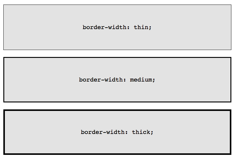
border-width属性有了三个特殊值可供选择,分别是:thin,medium和thick。效果如下:
看起来似乎将border属性分开来写不仅多余而且麻烦,但在某些特定的场合下还是很有用的,比如hover下改变边框的颜色,如果用简写的话还需要重复编写:
1
2
3
4
5
6
| .box {
border: 1px solid red;
}
.box:hover {
border: 1px solid green;
}
|
接用border-color属性的话依旧能达到同样的效果,而且这也是最合理的写法:
1
2
3
4
5
6
| .box {
border: 1px solid red;
}
.box:hover {
border-color: green;
}
|
2.border-radius
border-radius 是CSS3提供的,并且是第一个被社区广泛使用的属性。IE8以上,所有现在浏览器都支持显示圆角。因为有了它,妈妈怎么也不担心我不会photoshop了~
显然,为了在各个浏览器中达到同样的效果,border-radius需要加上特定的前缀:
1
2
3
| -webkit-border-radius: 10px;
-moz-border-radius: 10px;
border-radius: 10px;
|
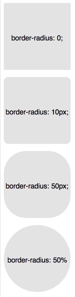
当然,我们也可以将它拆分成多个属性,自由的控制每一个角的显示:
1
2
3
4
| border-top-left-radius: 20px;
border-top-right-radius: 0;
border-bottom-right-radius: 30px;
border-bottom-left-radius: 0;
|
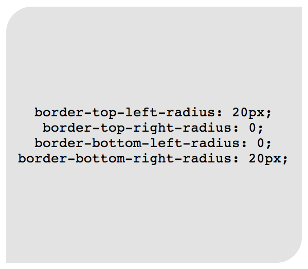
事实上,上面代码设置border-top-right-radius: 0和border-bottom-left-radius: 0;属性是多余的,除非该属性会被继承时才需要重设。很显然border-radius不需要。
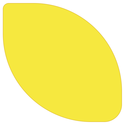
使用border-radius可以很简单的画一个柠檬:
1
2
3
4
5
6
| .lemon {
width: 200px; height: 200px;
background: #F5F240;
border: 1px solid #F0D900;
border-radius: 10px 150px 30px 150px;
}
|
额,是不是上面内容过于简单常见呢?我觉得也是,早就会了嘛。。接下来我们玩点新鲜的~
3. Multiple Borders
当我们想把多重边框应用到一个元素上的时,有很多技术我们可以参考:
(1). border-style
我们知道solid,dashed和dotted是border-style最常用的属性值。除了这些,我们还可以使用不常见的groove和ridge.
1
| border: 20px groove #e3e3e3;
|
也可以拆分成如下代码:
1
2
3
| border-color: #e3e3e3;
border-width: 20px;
border-style: groove;
|
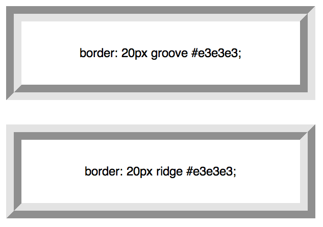
虽然这相当的有用,但是ridge或groove事实上都不是真正的多边框。
(2). outline
目前,创建两个边框最流行的技术是使用outline属性。
1
2
3
4
| .box {
border: 5px solid #292929;
outline: 5px solid #e3e3e3;
}
|
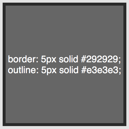
这种方法运行效果棒,但是有一个限制就是只能创建两个边框。如果你需要创建一个有分层、带渐变效果时,得使用另外的方法。
(3). pseudo element (伪元素)
当outline技术无法满足需要的时候,一种替代的方法是利用:before和:after伪元素,并且使用任何必要的额外边界生成的内容。
1
2
3
4
5
6
7
8
9
10
11
12
13
14
15
16
17
18
19
20
21
22
23
| .box {
position: relative;
width: 400px;
height: 400px;
background: #e3e3e3;
border: 10px solid green;
}
/* Create two boxes with the same width of the container */
.box:after, .box:before {
content: '';
position: absolute;
top: 0; left: 0; bottom: 0; right: 0;
}
.box:after {
border: 5px solid red;
outline: 5px solid yellow;
}
.box:before {
border: 10px solid blue;
}
|
虽然这种方法不是最优雅的,但却也能达到预期效果。但也一点不理想就是颜色的顺序和边界颜色容易混淆。
(4). box-shadow
最酷的且能创建无数边框的方法是利用box-shadow的spread参数。
1
2
3
4
5
6
| .box {
border: 5px solid red;
box-shadow: 0 0 0 5px green,
0 0 0 10px yellow,
0 0 0 15px orange;
}
|
通过设置box-shadow的x,y,blur为0,我们可以使用spread值来创建边框,由于box-shadow可以对方,通过使用“,”就可以无限创建边框,是不是很有意思呢…(注意,老的浏览器并不识别该属性,不过作为现代人,就应该使用现代浏览器!!!)
4. modifying angles
另外,我们可用使用“/”给border-radius赋值,定义唯一的水平和垂直半径:
1
| border-radius: 50px / 100px; /* horizontal radius, vertical radius */
|
等价于:
1
2
3
4
| border-top-left-radius: 50px 100px;
border-top-right-radius: 50px 100px;
border-bottom-right-radius: 50px 100px;
border-bottom-left-radius: 50px 100px;
|
这种技术是特别有用,当你需要模拟一个微妙的,冗长的曲线,而不是一个通用的圆角。例如,下面的代码允许我们稍微脱离一个正方形形状,就有卷纸一样的效果。
1
2
3
4
5
6
7
| .box {
width: 200px;
height: 200px;
background: #666;
border-top-left-radius: 15em 1em;
border-bottom-right-radius: 15em 1em;
}
|
5. css shapes
也许最赞的是将0宽度和0高度的边框运用于元素,很疑惑?哈…让我们看看示例:
下面几个例子都是用的同样的标记。
1
| <div class="box"></div>
|
增加样式如下:
1
2
3
4
5
| .box {
width: 200px;
height: 200px;
background: black;
}
|
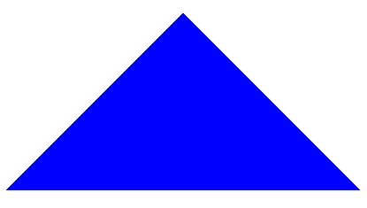
最流行的演示例子是在项目中如何使用css创建箭头。理解它的核心思想,你会发现其实也就是那么回事。首先得为每一边设置背景颜色然后同时设置容器的width和height的值为0。
假设有一个div并且带有一个叫arrow的class:
1
2
3
4
5
6
7
8
| .arrow {
width: 0;
height: 0;
border-top: 100px solid red;
border-right: 100px solid green;
border-bottom: 100px solid blue;
border-left: 100px solid yellow;
}
|
同时你也可以这样简写:
1
2
3
4
5
6
7
8
9
| .arrow {
width: 0;
height: 0;
border: 100px solid;
border-top-color: red;
border-right-color: green;
border-bottom-color: blue;
border-left-color: yellow;
}
|
还一种更为炫酷的写法,相信你会喜欢:
1
2
3
| width: 0; height: 0;
border: 100px solid;
border-color: red green blue yellow;
|
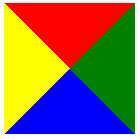
是不是很有趣呢?赶紧试试吧!我们只需要设置容器的宽度和高度为0,在设置各个边的颜色,宽度就能达到效果。那么当我们把其中的三条边的颜色设置为透明又会是什么效果呢?
1
2
3
4
5
| .arrow {
width: 0; height: 0;
border: 100px solid;
border-bottom-color: blue;
}
|
哈…这是一个充满神奇的世界。不过,我们的探索可不是仅仅止步于此!如果用一个div来表示一个箭头,太语意话了。在实际运用中我们常常会使用伪元素创建类似气泡的样式。
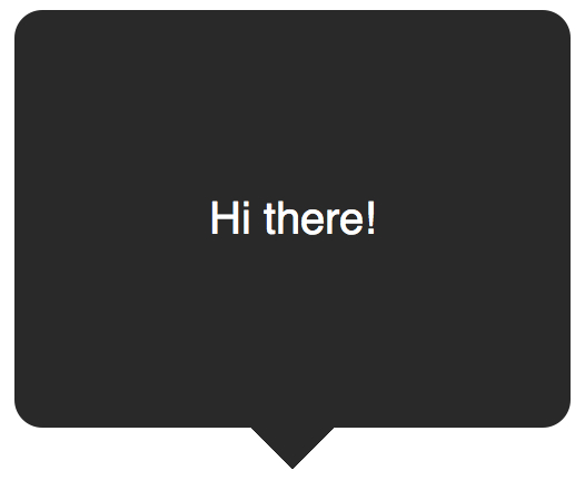
(1). create a speech bubble
我们可以用纯css创建一个类似气泡的对话。
1
| <div class="speech-bubble">Hello world</div>
|
增加css样式:
1
2
3
4
5
6
7
8
9
10
11
12
13
14
15
16
17
18
19
20
21
| .speech-bubble{
position: relative;
width: 200px;
height: 150px;
line-height: 150px; /* 垂直居中 */
color: white;
text-align: center;
background-color: #292929;
margin: 0 auto;
border-radius: 10px;
}
.speech-bubble:after { /*伪元素充当箭头*/
position: absolute;
content: '';
width: 0;
height: 0;
border: 10px solid;
border-top-color: #292929;
top: 100%;
left: 45%;
}
|
(2). 垂直居中
如上,如果文字很多的话,设置line-height是效果不好的,可以将容器的display设置为table,在设置容器中的文字为vertical-align: middle
1
2
3
| <div class="speech-bubble speech-bubble-top">
<p>Text goes here.</p>
</div>
|
css为:
1
2
3
4
5
6
7
8
9
| .speech-bubble {
/* other styles */
display: table;
}
.speech-bubble p {
display: table-cell;
vertical-align: middle;
}
|
css是一个很神奇的东西,只要我们换个角度去思考就会有不一样的效果。附上两个例子:
总结
css 是一个很神奇的东西好好努力!!!